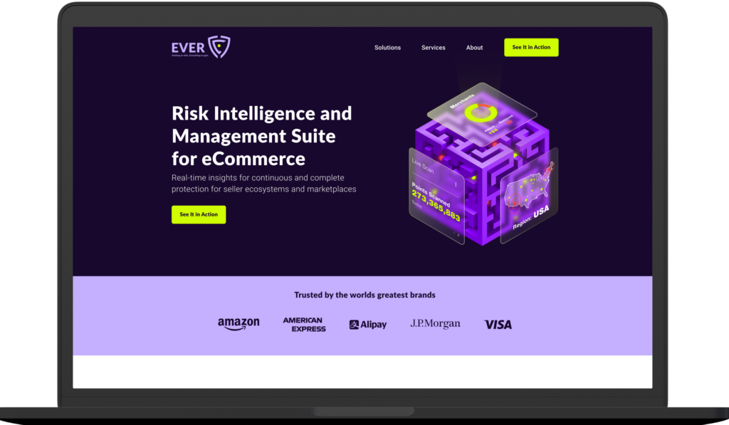
We redesigned the existing logo, leaving the main idea intact. We changed the shape to resemble a shield. This conveys the idea of security and safety that the understanding of risks gives the companies who use the product.
![](https://artos.design/wp-content/uploads/2022/09/Group-6926.png)
![](https://artos.design/wp-content/uploads/2022/09/383-1-1024x603.jpg)
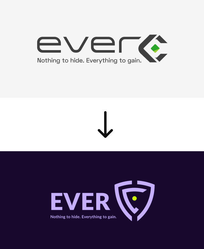
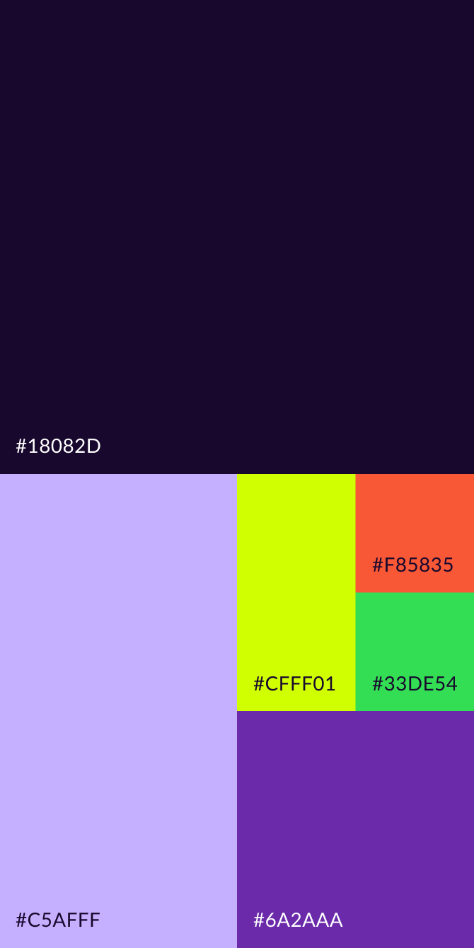
The color palette was carefully chosen to represent the brand:
a modern, bold and innovative vision.
![](https://artos.design/wp-content/uploads/2022/09/Group-6918.png)
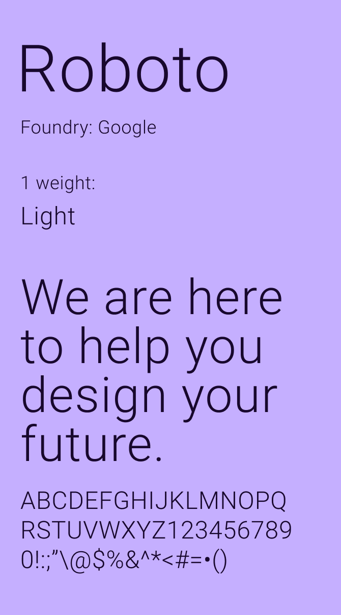
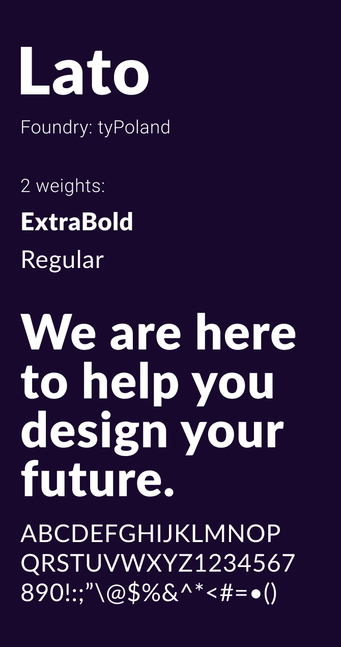
The clean–yet bold and strong–Lato and Roboto typefaces were chosen to represent the clarity and simplicity that working with EverC gives its customers.
![](https://artos.design/wp-content/uploads/2022/09/Group-6928.png)
![](https://artos.design/wp-content/uploads/2022/09/Group-6929.png)
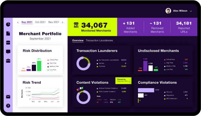
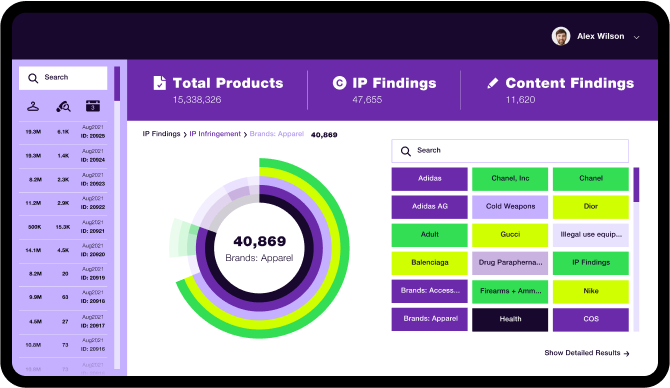
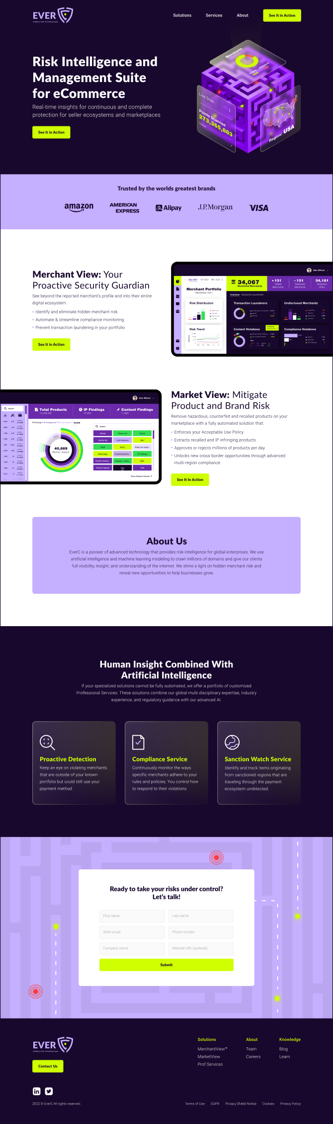
Home page of the website:
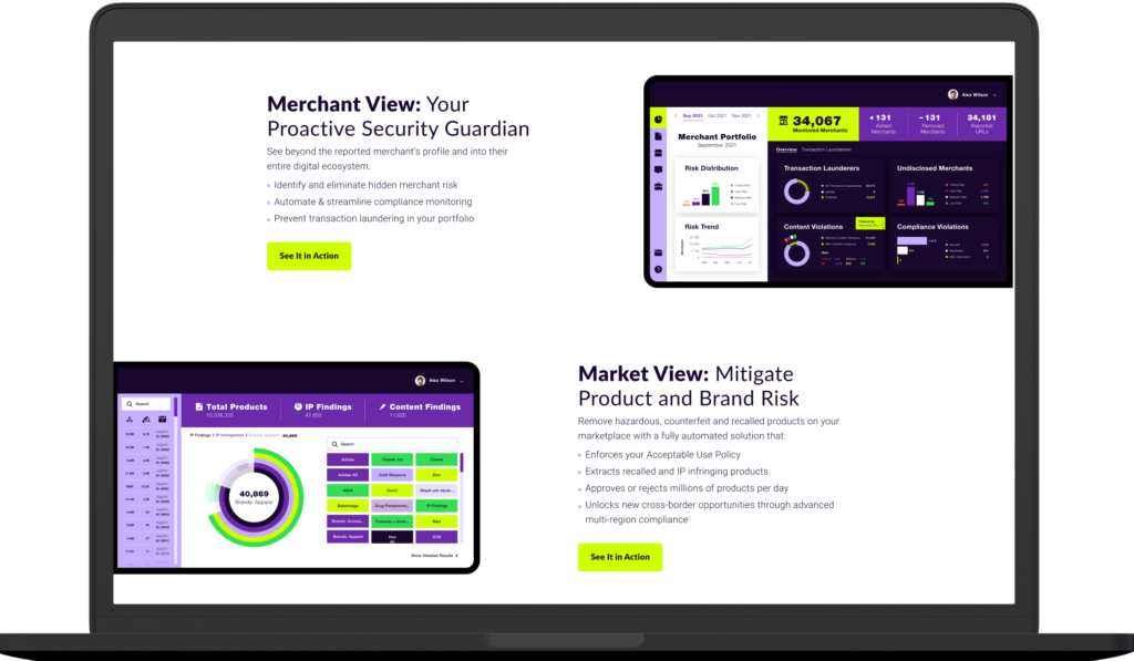
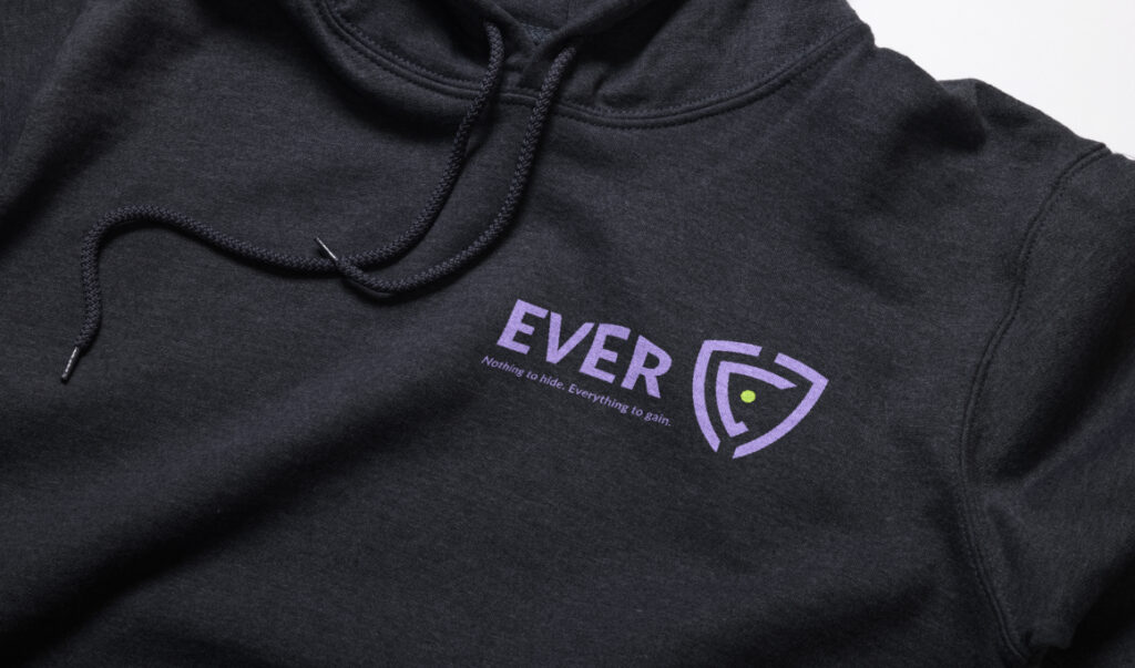
![](https://artos.design/wp-content/uploads/2022/09/Group-67207-1024x597.png)
![](https://artos.design/wp-content/uploads/2022/09/Group-67208-1024x597.png)
![](https://artos.design/wp-content/uploads/2022/09/Group-67209-1024x597.png)
![](https://artos.design/wp-content/uploads/2022/09/Group-67210-1024x597.png)
![](https://artos.design/wp-content/uploads/2022/09/2-4.png)
Product close-ups:
![](https://artos.design/wp-content/uploads/2022/09/Group-6934.png)
![](https://artos.design/wp-content/uploads/2022/09/Group-6933.png)